I’m probably preaching to the visualization choir here, but hopefully this could be helpful for newcomers to the field. This post is based on information given to me by my PhD-supervisor/anti-rainbow-colormap-activist
Charl Botha. I’ll start off by explaining why rainbow colormaps are almost never a good choice with some references and will provide some good alternatives and resources at the end.
There are two main problems with using a rainbow colormap in (medical) visualization. The first is that it doesn’t have a natural ordering. If you ask people how they would rank yellow and blue, they have to guess. There is of course order in there (shorter to longer wavelength of light), but it’s not perceptually ordered [1].

Perceptual ordering. (a) We can easily place the gray paint chips in order based on perception, (b) but cannot do this with the colored chips. [1]
The second problem is that it’s not perceptually linear, so equal distances in the scale do not appear equally different color-wise. For example, people perceive the 1st and the 5th colors in your colormap to be much more different than the 5th and the 9th, when these colors would be assigned to data-values that differ by identical amounts.This is actively misleading users. Furthermore, it introduces artifacts: There are perceived sharp transitions in data at the sharp transitions between hues [1]. In the figure below this effect is clearly visible on an artificial dataset:

Four data sets visualized with (a) rainbow, (b) gray-scale, (c) black-body radiation, and (d) isoluminant green–red color maps. Apparent sharp gradients in the data in (a) are revealed as rainbow color map artifacts, not data features, by comparing this row with the same data viewed using the other color maps. conversely, the sharp gradient found at the center of the second data set (see the second column) shown in the gray-scale and blackbody radiation (and to a lesser extent, the isoluminate green–red) images is not found in the corresponding image with the rainbow color map. [1]
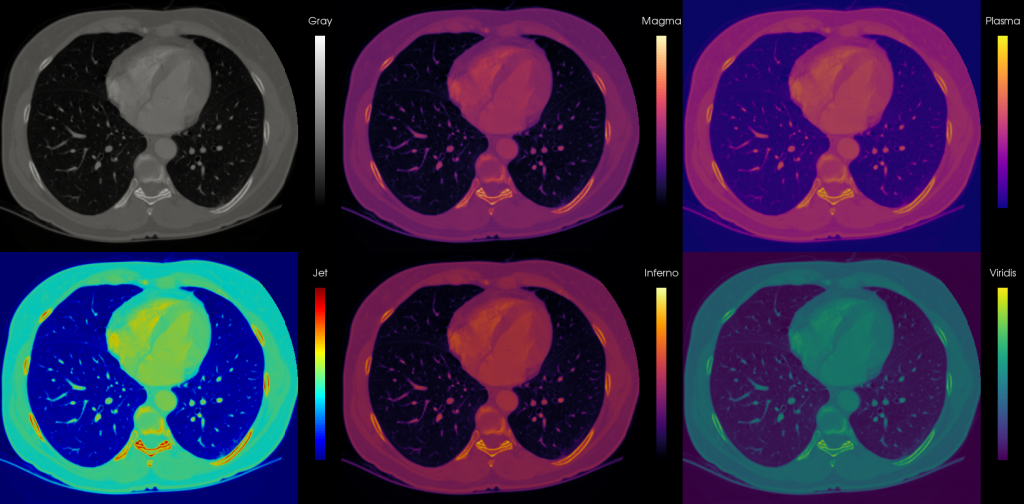
This figure shows the same effect on a MRI scan of the head. The rainbow colormap creates perceived contours where there are none in the data, so that structures within these bands are not represented. On top of that attention is drawn to the yellow areas, because they are the brightest, but not necessarily the most important [2]:

Four colormaps applied to a slice of an MRI scan of a human head. They demonstrate how the representation can influence the
interpretation of the data. [2]
So by now, you may be asking yourself: ‘If you hate the rainbow colormap so much, why don’t you come up with a better one?’ The answer to this is, people have! But despite all the warnings, in the IEEE Visualization Conference proceedings of 2005, 52% of the medical papers and 59% of the non-medical papers still used the rainbow colormap [1]. In any case, here are some alternatives you could consider (from [1], with examples added):
- For nominal data (data that doesn’t have implied order): use a selection of distinct colors. A good choice is a qualitative scheme from colorbrewer2.org, for example this colorblind safe four color qualitative scheme:

- For high-frequency ordinal data (data that does have order but no distance metric, including medical images): use gray-scale or heated body scale, for example the Gray colormap from Matlab or the Heated-Object scale colormap from Haim Lefkowitz’ color center.
- For colormaps on a surface: use an isoluminant colormap such as a saturation scale from for instance red to green or a double-ended scale like green to gray to red.
- For interval (measurable distances) and ratio (measurable distances and zero point) data: use a double-ended scale. The double-ended scale can be useful to indicate on which side of the zero a region lies. For instance if your scale goes from purple to white to green, the purple values will be below zero, while the green values will be above.
Besides just not using the rainbow colormap, you might also want to take factors like colorblind safety and printer friendliness (for papers) into account. To conclude this post, here are some resources you can use to pick a cool (or hot) colormap for your visualization needs:
- Colorbrewer: officially color advice for cartography, but has cool interactive features to see the effects of a chosen colormap on several types of data.
- Haim Levkowitz’s color center: features downloadable perceptually linear colour maps, including the heated-object scale.
- Matlab colormaps: Matlab has some pretty colormaps built in, like the heated body ‘Hot’ and other perceptually linear colormaps like Gray, Summer, Bone and Pink. Just stay away from those rainbows please 🙂
- Perceptually improved colormaps for Matlab: three perceptual colormaps with rainbow-like colors for interval data and a colormap for ratio data.
- Update: I have written a follow-up post on four new beautiful perceptually linear colormaps designed for Matplotlib, but free to use anywhere.
References
- [1]: D. Borland and R. M. Taylor, “Rainbow Color Map (Still) Considered Harmful,” IEEE Computer Graphics and Applications, vol. 27, no. 2, pp. 14-17, Apr. 2007.
- [2]: B. E. Rogowitz, L. A. Treinish, and S. Bryson, “How not to lie with visualization,” Computers in Physics, vol. 10, no. 3, pp. 268–273, 1996.
- Bonus: Drew Skau has also written a great blog post against rainbow colormaps
- Bonus 2: Another great article: Why Should Engineers and Scientists Be Worried About Color?
- Bonus 3: A series of posts on the rainbow and similar color palettes: The rainbow is dead… long live the rainbow!
- Bonus 4: And another amazing one by eagereyes: How The Rainbow Color Map Misleads
- Bonus 5: Matlab changed the default colormap away from the rainbow! Why you should dump the rainbow