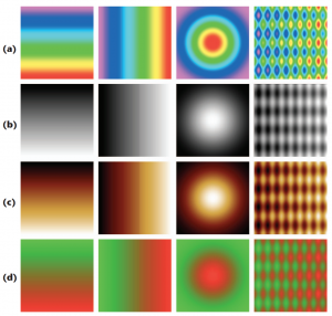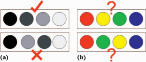
Four data sets visualized with (a) rainbow, (b) gray-scale, (c) black-body radiation, and (d) isoluminant green–red color maps. Apparent sharp gradients in the data in (a) are revealed as rainbow color map artifacts, not data features, by comparing this row with the same data viewed using the other color maps. conversely, the sharp gradient found at the center of the second data set (see the second column) shown in the gray-scale and blackbody radiation (and to a lesser extent, the isoluminate green–red) images is not found in the corresponding image with the rainbow color map. [1]
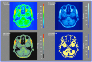
This figure shows the same effect on a MRI scan of the head. The rainbow colormap creates perceived contours where there are none in the data, so that structures within these bands are not represented. On top of that attention is drawn to the yellow areas, because they are the brightest, but not necessarily the most important [2]:
- For nominal data (data that doesn’t have implied order): use a selection of distinct colors. A good choice is a qualitative scheme from colorbrewer2.org, for example this colorblind safe four color qualitative scheme:

- For high-frequency ordinal data (data that does have order but no distance metric, including medical images): use gray-scale or heated body scale, for example the Gray colormap from Matlab or the Heated-Object scale colormap from Haim Lefkowitz’ color center.
- For colormaps on a surface: use an isoluminant colormap such as a saturation scale from for instance red to green or a double-ended scale like green to gray to red.
- For interval (measurable distances) and ratio (measurable distances and zero point) data: use a double-ended scale. The double-ended scale can be useful to indicate on which side of the zero a region lies. For instance if your scale goes from purple to white to green, the purple values will be below zero, while the green values will be above.
Besides just not using the rainbow colormap, you might also want to take factors like colorblind safety and printer friendliness (for papers) into account. To conclude this post, here are some resources you can use to pick a cool (or hot) colormap for your visualization needs:
- Colorbrewer: officially color advice for cartography, but has cool interactive features to see the effects of a chosen colormap on several types of data.
- Haim Levkowitz’s color center: features downloadable perceptually linear colour maps, including the heated-object scale.
- Matlab colormaps: Matlab has some pretty colormaps built in, like the heated body ‘Hot’ and other perceptually linear colormaps like Gray, Summer, Bone and Pink. Just stay away from those rainbows please 🙂
- Perceptually improved colormaps for Matlab: three perceptual colormaps with rainbow-like colors for interval data and a colormap for ratio data.
- Update: I have written a follow-up post on four new beautiful perceptually linear colormaps designed for Matplotlib, but free to use anywhere.
References
- [1]: D. Borland and R. M. Taylor, “Rainbow Color Map (Still) Considered Harmful,” IEEE Computer Graphics and Applications, vol. 27, no. 2, pp. 14-17, Apr. 2007.
- [2]: B. E. Rogowitz, L. A. Treinish, and S. Bryson, “How not to lie with visualization,” Computers in Physics, vol. 10, no. 3, pp. 268–273, 1996.
- Bonus: Drew Skau has also written a great blog post against rainbow colormaps
- Bonus 2: Another great article: Why Should Engineers and Scientists Be Worried About Color?
- Bonus 3: A series of posts on the rainbow and similar color palettes: The rainbow is dead… long live the rainbow!
- Bonus 4: And another amazing one by eagereyes: How The Rainbow Color Map Misleads
- Bonus 5: Matlab changed the default colormap away from the rainbow! Why you should dump the rainbow


Hurray for this post. This cannot be stressed enough! Especially the percentage of technical papers is quite disturbing really. You’d expect these communities to adopt such principles earlier. If only we could get this into the paper editing process: reject all rainbows :).
Thanks! I completely agree. I can’t believe how often you still come across them. I believe the main argument for using them is: ‘They asked me to!’, but isn’t it then up to us to explain why this is not a great idea?
Great, thank you for turning my incoherent-foaming-at-the-mouth-ramblings into something that we can actually point people at! 🙂
This all sounds familiar. Might have read this a couple of times over the past few years. Hope your post will have more effect, but I’m afraid we will see more rainbows in the future :).
However, nothing to remark on the contents of your post Noeska :). Or, maybe one thing.
“Rainbow Colormaps – What are they good for? Absolutely nothing!”
Wrong.
– They are good for (heated (pun intended)) beer discussions
– They are good for blog posts
– They are good for Nyan cat! http://www.youtube.com/watch?v=QH2-TGUlwu4
P.S. What did Charl pay you to post this?
Thanks!
Let’s indeed hope for a dramatic reduction in the amount of rainbow colormaps used. I enjoy rainbows and their pretty colors as much as the next person, but just say no to rainbows in visualization ^^
P.S. Nothing! I didn’t even get a medvis.org e-mail address 😉
I will spread the word, from my nostalgic medvis.org address. 😉
This is, for all of us vis people and for me in particular, a very interesting and challenging post. I however have to be the devil’s advocate and pour a cold shower on the argumentation. Not that I (necessarily) WANT to. But please consider the objective points below:
1) You say that the rainbow colormap “doesn’t have a natural ordering”. I disagree practically and fundamentally. Practically: we all know what a cold-to-hot colormap is (I argue); if we don’t then I would argue that NO colormap is effective, since we have no sense of a hue ordering whatsoever. Fundamentally, and more importantly: what is your definition of ‘natural’? What is a natural ordering? This is no loose shot question – and I do not know any fundamental answer to it.
2) Reference [1] is indeed a reference, but an extremely poor one. I’ve read that paper like 5 times, and for me its summary is: (a) rainbow colormaps are suboptimal [agree]. (b) for VERY particular cases, here’s a better colormap [agree]. (c) for the general case of continuous data, ehm, we have no answer [agree, so, what’s the replacement for the rainbow thing you propose in general? None]. It is very easy to criticize something (I mean [1]) without giving no alternative which is robustly, fundamentally, and generally valid. Yes, people point at ColorBrewer. Nice. Note that ColorBrewer colormaps (a) don’t work for a large (>10) colors AND for colors that have to be displayed on a white background? So, in such cases, what is better than the rainbow colormap, and why?
3) You say that people have come with a better alternative to the rainbow colormap. Is this true in GENERAL, meaning, for any 2D continuous signal, to be displayed on any type of background? If so, which is the alternative? And if so, how is it explained that relatively well-known software tools such as Matlab, Mathematica, AVS/Express, ParaView, MayaVi, MeVisLab all offer the rainbow colormap as one of the main defaults AND do not offer something better as GENERAL alternative? I am curious.
4) The alternatives offered in your post create IMO as many problems/challenges as they solve:
a) qualitative data: the ColorBrewer scheme works OK only for a small number of colors (<8..maybe 10). Beyond? No answer.
b) high-frequency ordinal data: grayscale is not as effective as hue-based (e.g. rainbow). Depends a lot on your output device. Dare to say that we (the average humans) can distinguish more hues than grayvalues. If not, I'd like to see the proof. Heatmap: nice, but what if we have to display it on a white background, like in the case of scattered point data on a white canvas? Won't work.
c) "use an isoluminant colormap such as a saturation scale from for instance red to green or a double-ended scale like green to gray to red." Sure you can. And then, why is this better than rainbow? What about people complaining they cannot separate red from green [color blind]?
d) Resources: Yes, it's nice to cite a lot of resources, but honestly, the problem is that they only give guidelines which may apply in particular cases. Why are these better, demonstrably, than the rainbow colormap, in the general case? I have no answer.
Concluding: it's easy to trash something saying it's bad. Sure. So what is demonstrably better (than the rainbow colormap) in all cases? And why so many tools use it, if it's bad, and if they had an immediate alternative for it?
So, if you have an alternative which
-shows a large set of color-to-value mappings, for many values
-works on any background (black..white)
-works for any number (3..5..255..1000 etc) data values
-can be easily interpolated to create more colors
-is demonstrably better understood by the average user
please let us know, and post the color table/code.
So, as some philosopher said, I would rather keep all as is, and change only the necessary, when and if demonstrated.
Alex Telea
LTNS Alex, welcome to medvis.org!
You’ve written a complete blog post in the comments, nice! 😉
1. Give a random sampling of visualization users green, yellow, blue, red and ask them to order the colours. You’ll get far more mistakes (relative to H=[0,1]) than you would get with a single hue scale.
2. That’s the wrong question. The right question is: What type of data are you visualizing. Rogowitz is a good start. Using a hue-based colourmap for continuous valued data is probably not the best of ideas.
3. Seeing that we’re discussing colour, I’m going to call your red herring. 😉 Rogowitz and other good references point out that you use a different colourmap depending on the type of data, the tasks and the domain. The reason why so many tools use the rainbow colourmap is not because it’s a general solution to the problem, it’s because it’s the easiest solution. BTW, there has been some good work from the ParaView community on improving their colourmaps: http://www.sandia.gov/~kmorel/documents/ColorMaps/ (there’s a 2009 paper also)
4. The same red herring. There is no general solution, and Noeska’s post never claimed there was.
As some other philosopher said, pick the right tool for the job. 🙂 Fortunately, the tools are available and easy to implement.
Hi Charl,
Thanks for the detailed reply. I entered the discussion/blog/forum thing since I (a) see this kind of discussion spreading around more and more and (b) adversely affecting various practitioners in various, in my view, suboptimal ways (the discussion is more like saying what’s bad rather than showing solutions).
Let me zoom in on my original (probably not so clearly conveyed) message: To your points:
a) How do you know that users ordering colors along a rainbow colormap make, on the average, more mistakes (wrt values mapped by colors), than ordering colors along a single-hue map? Any serious data on that? My whole experience tells the opposite – to put it so, it is easier to tell apart blue from green than dark-somthing-hue from not-so-dark-something-hue.
b) my point/questions stand. Any alternative wrt rainbow for continuous, >10 values, colormaps that have to be drawn on a white background? What I meant to say is that [1] says that rainbow is not good IN GENERAL and then it gives examples where other colormaps are better IN PARTICULAR cases. That I call indeed a red herring.
c) Sure, didn’t mean to say that if X tools to rainbow, then rainbow is good. Just meant to say that if X tools or researchers do that, probably their developers are not completely stupid (assuming there was a clearly better alternative _for their contexts_). I wanted to stress that just saying something is not perfect is not a solution in itself UNLESS someone provides a solution which is better wrt ALL circumstances where the original one was used.
d) The original post had the title “Rainbow Colormaps – What are they good for? Absolutely nothing!” That is, to say the least, a bit extreme. And IMO it also implies that, if you call X being absolutely no good, then you should come with an alternative for all cases where people used X for the sake of something better.
NOTES: Yes, I’ve seen the alternative colormaps of ParaView. Again, they work reasonably well for ordering values when you have a dense signal not drawn on a white background. But, assuming you draw something like a point cloud (or anything else that doesn’t cover your full viewport), then you just cannot use white/very light shades – they will be ambiguous wrt “a certain data value” or “no data there”. Funnily enough, almost all alternatives to rainbow use a non-negligible amount of white, meaning, they’re not good for those cases.
My personal conclusion/question:
-surely, every case is particular, and may benefit from something custom (if you have the time/tools/freedom to customize)
-when any of the above does not apply: what is then the least worst alternative? If we have no fundamental answer to this question, then it’s as good as saying “you can use whatever you want”, meaning, peacock, rainbow, or German flag for that matter is equally good [no irony intended].
NOTE: I’ve heard colorbrewer mentioned like 100 times blindly in the last 5 years. I’m amazed this happens, given that colorbrewer ONLY provides a few-entry colormaps, NO continuous colormap, and HEAVILY uses light colors that will simply not work for non-compact data domains. This makes me worried that more and more people just dismiss of the problem by quoting stuff rather than attempting to solve it.
and the default ‘jet’ colormap has yellow, so also can’t be used for this purpose.
I’d also like to know a good general-purpose solution that doesn’t have the streaks of bright yellow and cyan that jet has.
First of all, Charl, congratulations on the Visual Computing for Medicine book (2nd edition) which appeared a few months ago. From what I’ve seen on the web (free chapters), this is outstanding work in a very important area for visualization users!!
To the topic of this blog: from the free chapters, I spotted like ~5 or more examples of rainbow colormaps being used in there. If you subscribe that the rainbow colormap is good for absolutely nothing (blog title), then, why do you allow them to be used in such a high-level material as a printed book?
Sure, I can understand that image X is made by person Y and you cannot change it. But if you stand by the point (as you seem you do) that rainbow colormaps are absolutely no good (as the blog title implies, right?) than you should absolutely not use them. Or is there something I miss?
PS: no sarcasm involved – I just want to get a clear idea where you stand for, in the global context of this discussion. Any option is OK as long as it’s coherent.
Regards,
Alex Telea
Pingback: Why you should dump the Rainbow | Engage
Pingback: Cyclic colormap without visual distortions for use in phase angle plots? - Technology
Two-three years later, my question still stands:
What continuous colormap do we have, of roughly uniform luminance (so it can be used against a white background), which is _provably_ better at ordering and/or ratios than the rainbow?
From all my knowledge, small or large, I do not see an an answer.
And, Charl, I agree: implementing a new colormap takes you 10 minutes (the time to type in some values in some array). So, rainbow or X-bow (whatever X) is as easy. Hence, the differentiator is quality, not ease of implementation.
So, again: What _continuous_ colormap do we have, of roughly _uniform_ luminance (so it can be used against a white background), which is _provably_ better at ordering and/or ratios than the rainbow?
Any strong answer? If not, sorry, but ‘read Rogowitz’ is not a solution.
Alex
You might have missed it, but members of the Python scientific community designed an open source tool for generating perceptually defensible colour maps, and then used this tool to generate new default colour maps for matplotlib.
See hear the medvis.org blog post about that work: https://medvis.org/2016/02/23/better-than-the-rainbow-the-matplotlib-alternative-colormaps/
See here one of the authors’ own write-ups: https://medvis.org/2016/02/23/better-than-the-rainbow-the-matplotlib-alternative-colormaps/
Oh, and for the record, I had some (pertinent) questions in 2014 (my last blog) which I don’t see an answer for.
Easy to create a hype; hard to provide a solution. No?
Alex
We will gladly refund your medvis.org membership fees! 😉
Seriously though: This post was made to act as a reference for the community’s move away from rainbow colourmaps to perceptually defensible alternatives, a move which is now for a large part complete, judging by how research groups and their members now approach the problem of colour map selection in vis.
In that the post has done a sterling job with more than 15000 reads; we know that it has been used many times in educational projects.
Anyways, people are of course to fee to do what they think is best, and sometimes they even have good reasons for this. For me personally, arguing these edge cases falls under diminishing returns, which is why it does not get the highest priority.
Thank you very much for this helpful post!
For example I see pluviometry maps with categories, i.e. from 5 to 10 liters/m2 blue; 10 to 15 yellow, etc. It is absurd.
Simon.
Pingback: “Poppies? What poppies?” a.k.a. Designing for Color Blindness | UX Blogs