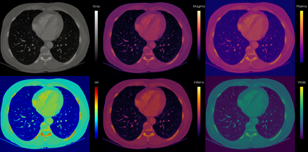
I know our post on or rather against the use of rainbow colormaps is one of the most well-read on our blog. It gets referenced quite a bit and is even used in visualization lectures. It’s been a while since it was written though, and now it seems like a good time for an update featuring the beautiful alternative colormaps now included in Matplotlib. Let’s start with a little teaser image:

Two classics and the four new colormaps applied to medical data!
In 2014, MATLAB switched their default colormap from ‘Jet’, which was really a rainbow colormap disguising with a pretty name, to ‘Parula’:

Parula: P is for Pretty
After this great step forward for colormap activists worldwide, the people rejoiced. However, then it turned out Parula is MathWorks intelectual property and you can’t use it in your own applications. Also, it’s a step up, but not quite perceptually linear yet. Fear not though, because Stéfan van der Walt and Nathaniel Smith, both Computational Fellows at the Berkeley Institute for Data Science, came to the rescue and set out to create four even prettier (in my humble opinion as well as perceptually) colormaps to be used in Matplotlib and well everrrrywhere with a “no rights reserved” license.
They designed four beautiful and functional colormaps festively entitled Magma, Inferno, Plasma and Viridis:

Magma

Inferno

Plasma

Viridis
Pretty, no? For reasons I cannot quite articulate I find myself most drawn to Magma and Viridis. Luckily for me, Viridis ‘won’ the vote and is now the default colormap in Matplotlib from version 2.0 on. See them in action side-by-side with the Matlab alternatives Jet and Parula here (or get the full resolution file here):
So in the left column: Jet and Parula, the center shows Magma and Inferno and on the right we have Plasma and Viridis. Notice how Jet is banding like crazy, Parula is better than Jet, but somehow looks a bit flat, while the other four are kicking ass and taking numbers? Mesmerizing!
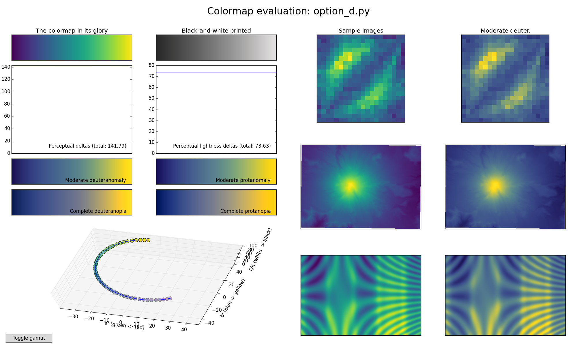
That’s not all though, they also built a colormap tool that helps visualize how colormaps work and how perceptually uniform they are called viscm, in which you can design your own colormaps and generate images like this for comparison:

Mmmm, Viridis! Check out the flatness of those perception curves and colorblind- and printer-friendliness…
Their fascinating and hilarious talk at SciPy2015 outlines the whole story:
You can read more about the colormaps and admire their prettiness in their elaborate writeup featuring many cool comparison images and videos, as well as a short explanation on how to use viscm. Third parties have also made the four maps including Viridis available in R, Matlab, D3 and Paraview.
Resources:
- The official announcement introducing the four new colormaps and everything you need to get started using it.
- Their awesome colormap generation scripts including the colormaps they made.
- Some more about the teaser image I made on my personal blog, including some thoughts on 3D use.
- The four colormaps in Paraview.
- Matlab Parula motivation.

Thanks for this write-up!
What I found wonderful to hear, was that the recent LIGO paper (the gravity waves one!!) also used Virids!! https://twitter.com/stefanvdwalt/status/697820444611579904
(not only that, but jupyter / ipython notebooks!)
That is really great news! Viridis for president!