The ‘Medical Visualisation and Human Anatomy’ MSc programme in Glasgow (Scotland)

(We are very thankful and happy to receive this guest contribution from Lauren Clunie on the newly introduced ‘MSc in Medical Visualisation and Human Anatomy’ programme in Glasgow. In this post, she offers us a first-hand glimpse into the contents of this programme.)

Hello, my name is Lauren Clunie and I am a postgraduate student from Glasgow. I am new to the medvis community and I feel privileged to have been asked to write about the course I am studying. I hope to give you a quick, and hopefully interesting, insight into what the course entails.

The MSc in Medical Visualisation and Human Anatomy is a one year taught masters programme that is run by the Glasgow School of Art in collaboration with Glasgow University. The course is still very new; it began in September 2011 and is the first of its kind in the UK. It is mainly aimed for life sciences graduates who want to increase their knowledge for the digital aspects of medical science; however the course can also accommodate for computer science graduates who wish to specialise in medical technology.

Lab 1 at the Digital Design Studio - The largest stereo projection space in the UK.

Lab 1 at the Digital Design Studio – The largest stereo projection space in the UK.

My background is in anatomy, I graduated from the University of Dundee with joint honours in anatomy and physiology. I was very indecisive as to what my next step would be after I graduated; all I knew for sure was I am motivated by my passion and enthusiasm for the complex structure of the human body and how it works. I had always been intrigued by the use of technology within medical science. In May last year, when I heard about this course, I knew instantly that this was the right step for me to take. I am fascinated by the endless number of applications that are associated with medical visualisation and I am excited to be involved in such an up-and-coming field.

The course is split into 3 stages; Stage 1 is taught at the Glasgow School of Art, Stage 2 at Glasgow University and Stage 3 is spent completing a masters research project. Between September and December last year, I had the privilege of studying at the Glasgow School of Art’s Digital Design Studio which is the largest 3D stereo lab in Europe. During this first stage we learnt how to use a number of software’s including Autodesk Maya for developing medical animations; Unity3D to develop applications and interactive games for medical education (including the use of javascript) and also Amira to produce 3D visualisations from CT and MRI data. With very little experience in this type of technology I was really thrown into the deep end during this stage of the course. However, it was very much taught in relation to its practical use in medical science which made it interesting and easier to understand. I am now in Stage 2 of my degree which involves learning the anatomy of the whole human body in great detail. This stage is taught in the world renowned Anatomy Laboratory at Glasgow University. Thanks to my undergraduate degree, this stage has not been as difficult as Stage 1; however this has allowed me more time to focus on revising the digital aspect of the course as well as keeping up to date with current research going on in medical visualisation. The final stage of the course will begin in June when I undertake a 3 month long masters project that will combine all the skills I have gained from the first 2 stages.

I have found that I am very interested in the development of new technologies to enhance anatomical education for medical, dental, forensic and anatomy students. This masters course so far has affirmed my passion for anatomy. I hope it will open many doors for me in the future and I am enormously excited to begin my career in medical visualisation.

Thank you for your interest on this topic. Please take a look at the short promotional video that also helps to summarise this masters programme. If you would like to keep up to date with my progress or have any questions, please feel free to connect with me on LinkedIn or follow me on twitter (@LClunieMedVis).

Assistant Professor in Medical Image Analysis position open at Chalmers University of Technology, Sweden

The Chalmers University of Technology in Sweden is looking for an Assistant Professor in Medical Image Analysis, because a new research group in medical image analysis is in the process of being established there. The focus of the group is on the development of new and more effective medical imaging methods and systems for visualization, support and diagnostics. Your goal would be to develop new methods for segmentation, registration and reconstruction problems for large-scale problems from multi-modal sensor data such as CT, MR and ultrasound. The research will cover basic mathematical aspects of imaging with focus on algorithms as well as the development of prototype systems.

If this sounds like something you would be interested in, please take a look here or here. The closing date for this job opening is May 12th, 2013.

IEEE PacificVis 2013 Sydney Conference Report

(We are grateful and happy that Alexander Bock, of the Linköping University, Sweden SciVis group could write this short report on the medical visualization-related papers at IEEE PacificVis 2013 for us.)

“Bättre sent än aldrig”, “Besser spät als nie”, “Better late than never”. If a lot of different languages have proverbs for this concept, there must be some truth at the bottom of it. With almost 2 months of delay and after spending the last 2 weeks in PVSD (PostVis Stress Disorder), I will present some of my personal reflections regarding the IEEE PacificVis conference that took place in central Sydney, Australia this year.

The event was hosted by the University of Sydney and three researchers from this university — Peter Eades, Seok-Hee Hong and Karsten Klein were the public faces that guided the conference participants through the event. I am well aware that there are many
andd more people responsible for the organization and execution of the conference and I would like to thank all of those for their splendid work as well. Despite some minor location-related problems — yes, I’m looking at you, projectors! —, the conference was seemingly bug-free and ready to ship! All of the talks at the conference were recorded and I was assured that those videos would see the light of day at some point in the near future. At the time of writing this future has not happened yet, so there will be an update as soon as the presentations are made available.

The greater event started on Tuesday with the opening of the first PacificVAST workshop colocated with PacificVis and a great tutorial on Graph Drawing by Karsten Klein. I can say that for me, as a not graph-ically literate person, it was a very good overview and an even better introduction to the many graph drawing presentations that were to come during the next days. All of the presentations at PacificVAST this year were invited talks, but the organizers are happy to receive nice papers for PacificVAST 2014.

The first day of PacificVis began with a keynote given by Giuseppe Di Battista from the Università Roma Tre, who made one of his few trips outside of Italy to present this insightful thoughts about Graph Animation. Adding the challenge of temporal consistency to the already hard problem of finding good layouts for big graphs was a very interesting topic indeed.

The first two sessions of the day were concerned with “Text and Map Visualization” and “Big Data Visualization”. For brevity’s sake, I’m only highlighting one of the papers, namely “Reordering Massive Sequence Views: Enabling Temporal and Structural Analysis of Dynamic Networks” [1] by Stef van den Elzen et al. from SynerScope and the University of Eindhoven, The Netherlands, since –spoiler-alert– they won the Best Paper Award of the conference. They extended Massive Sequence Views to analyze dynamic networks and enable the user efficiently and effectively detect features in big, time-varying datasets.
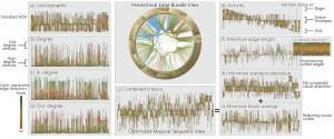
Stef van den Elzen, Danny Holten, Jorik Blaas, and Jarke J. van. Wijk: Reordering Massive Sequence Views: Enabling Temporal and Structural Analysis of Dynamic Networks

Stef van den Elzen, Danny Holten, Jorik Blaas, and Jarke J. van. Wijk: Reordering Massive Sequence Views: Enabling Temporal and Structural Analysis of Dynamic Networks [1]

The third session was titled “Volume Rendering” and featured four very nice papers. “Local WYSIWYG Volume Visualization” [2] by Guo and Yuan from the Peking University, China is an improvement of their Vis 2011 paper “WYSIWYG (What You See is What You Get) Volume Visualization” [3], which applies the in-place, stroke-based editing to general spatially localized transfer functions.
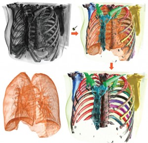
Hanqi Guo and Xiaoru Yuan: Local WYSIWYG Volume Visualization

Hanqi Guo and Xiaoru Yuan: Local WYSIWYG Volume Visualization [2].

The second paper called “Transfer Function Design based on User Selected Samples for Intuitive Multivariate Volume Exploration” [4] by Zhou and Hansen from the SCI Institute, University of Utah, USA, uses user selected samples in multivariate data to generate high dimensional transfer functions and allows the user to improve this transfer function with brushing and linking.
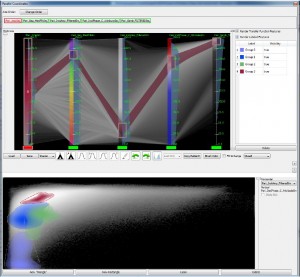
Liang Zhou and Charles Hansen: Transfer Function Design based on User Selected Samples for Intuitive Multivariate Volume Exploration

Liang Zhou and Charles Hansen: Transfer Function Design based on User Selected Samples for Intuitive Multivariate Volume Exploration [4].

“Evaluation of Depth of Field for Depth Perception in DVR” [5] by Grosset et al., also from the SCI Insitute, is a very nice evaluation of using Depth of Field effects in Direct Volume Rendering contexts. Requiring the user to depth-sort points in a rendering, they found that using a Depth of Field rendering technique is not always beneficial. In fact, DoF is beneficial if the feature is close to the camera, but the user performs worse in this task if the feature is at the far end of the object.
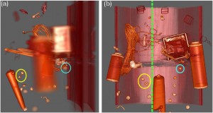
A.V. Pascal Grosset, Mathias Schott, Georges-Pierre Bonneau, and Charles Hansen: Evaluation of Depth of Field for Depth Perception in DVR

A.V. Pascal Grosset, Mathias Schott, Georges-Pierre Bonneau, and Charles Hansen: Evaluation of Depth of Field for Depth Perception in DVR [5].

The last paper in this session was “Transformations for Volumetric Range Distribution Queries” [6] by Martin and Shen from The Ohio State University, USA. They use a pre-processing step on big, volumetric data to allow for fast and efficient range queries during the rendering.
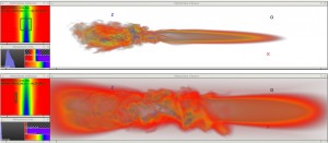
Steven Martin and Han-Wei Shen: Transformations for Volumetric Range Distribution Queries

Steven Martin and Han-Wei Shen: Transformations for Volumetric Range Distribution Queries [6].

The second day of the conference was started by the second keynote given by Chuck Hansen from the SCI Insitute, University of Utah. His topic of choice “Big Data: A Scientific Visualization Perspective” shed light on the Post-Petascale era of Scientific Visualization that is soon to come. As computing power increases exponentially not only for visualization researchers but also for the researchers who are writing physical simulations, the amount of data that experts have to be able to handle and analyze will increase exponentially as well. Glorious times ahead!

The first session of the second day was called “Visualization in Medicine and Natural Sciences” and started with “Guiding Deep Brain Stimulation Interventions by Fusing Multimodal Uncertainty Regions” [7] presented by me, Alexander Bock, from Linköping University, Sweden. So much for objectivity, but I will try nevertheless. In this paper we demonstrated a system to support the surgeon during a Deep Brain Stimulation intervention by showing him/her a combined view of all the measured data along with their associated uncertainty.
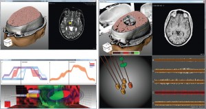
Alexander Bock, Norbert Land, Gianpaolo Evangelista, Ralph Lehrke, and Timo Ropinski: Guiding Deep Brain Stimulation Interventions by Fusing Multimodal Uncertainty Regions

Alexander Bock, Norbert Land, Gianpaolo Evangelista, Ralph Lehrke, and Timo Ropinski: Guiding Deep Brain Stimulation Interventions by Fusing Multimodal Uncertainty Regions [7].

The second paper in this session was “Discovering and Visualizing Patterns in EEG Data” [8] by Anderson et al. from the University of Utah. They had very high-dimensional EEG data from various patient trials and use cross-correlations and pattern detection to generate a spatio-temporal visualization to allow the expert to detect relationships between signals.
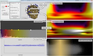
Erik W. Anderson, Catherine Chong, Gilbert A. Preston, and Cláudio T. Silva: Discovering and Visualizing Patterns in EEG Data

Erik W. Anderson, Catherine Chong, Gilbert A. Preston, and Cláudio T. Silva: Discovering and Visualizing Patterns in EEG Data [8].

Following two non-medical papers, Silvia Born from the University of Leipzig, Germany, presented her paper “Illustrative Visualization of Cardiac and Aortic Blood Flow from 4D MRI Data” [9]. In this work she generates simple and illustrative visualizations of blood flow patterns based on 4D MRI data. Extending her work “Visual 4D MRI Blood Flow Analysis with Line Predicates” from PacificVis 2012 [10], she created an even more intuitive and easy-to-understand rendering of the measured velocity vector field.

Silvia Born, Michael Markl, Matthias Gutberlet, Gerik Scheuermann: Illustrative Visualization of Cardiac and Aortic Blood Flow from 4D MRI Data

Silvia Born, Michael Markl, Matthias Gutberlet, Gerik Scheuermann: Illustrative Visualization of Cardiac and Aortic Blood Flow from 4D MRI Data [9].

Of all the good posters that were presented at the conference, I want to highlight one with the title “Efficient Visibility-driven Transfer Function for Dual-Modal PET-CT Visualization using Adaptive Binning” by Jung et al. from the University of Sydney, Australia. They described a faster technique to calculate visibility histograms by using a binning approach on a clustered version of the scanned data.
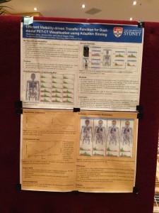
Jung et al.: "Efficient Visibility-driven Transfer Function for Dual-Modal PET-CT Visualisation using Adaptive Binning" poster.

Jung et al.: “Efficient Visibility-driven Transfer Function for Dual-Modal
PET-CT Visualisation using Adaptive Binning” poster.

As this post is already far too long, and none of the remaining sessions (namely: “Time–varying and Multivariate Visualization”, “Visual Analytics”, “Tree and Graph Visualization” and “Vector and Tensor Fields Visualization” contained directly medvis research, I will wrap this one up by thanking all of the speakers and the organizers and by stating that I could unfortunately only present a small subset of all the good papers that were presented at the conference. As soon as the Proceedings are published, I hope that everybody can reach the same conclusion.

  • [1] Stef van den Elzen, Danny Holten, Jorik Blaas, and Jarke J. van. Wijk: “Reordering Massive Sequence Views: Enabling Temporal and Structural Analysis of Dynamic Networks.”
  • [2] Hanqi Guo and Xiaoru Yuan: “Local WYSIWYG Volume Visualization.” URL: http://vis.pku.edu.cn/research/publication/PacificVis13_ltf.pdf
  • [3] Hanqi Guo, Ningyu Mao, and Xiaoru Yuan: “WYSIWYG (What You See is What You Get) Volume Visualization.” URL: http://vis.pku.edu.cn/research/publication/Vis11_wysiwyg-small.pdf
  • [4] Liang Zhou and Charles Hansen: “Transfer Function Design based on User Selected Samples for Intuitive Multivariate Volume Exploration.”
  • [5] A.V. Pascal Grosset, Mathias Schott, Georges-Pierre Bonneau, and Charles Hansen: “Evaluation of Depth of Field for Depth Perception in DVR.” URL: http://hal.inria.fr/docs/00/76/25/48/PDF/dofEval.pdf
  • [6] Steven Martin and Han-Wei Shen: “Transformations for Volumetric Range Distribution Queries.”
  • [7] Alexander Bock, Norbert Land, Gianpaolo Evangelista, Ralph Lehrke, and Timo Ropinski: “Guiding Deep Brain Stimulation Interventions by Fusing Multimodal Uncertainty Regions.” URL: http://scivis.itn.liu.se/publications/2013/BLELR13//pavis13-dbs.pdf
  • [8] Erik W. Anderson, Catherine Chong, Gilbert A. Preston, and Cláudio T. Silva: “Discovering and Visualizing Patterns in EEG Data.”
  • [9] Silvia Born, Michael Markl, Matthias Gutberlet, Gerik Scheuermann: “Illustrative Visualization of Cardiac and Aortic Blood Flow from 4D MRI Data.”
  • [10] Silvia Born, Matthias Pfeifle, Michael Markl, Gerik Scheuermann: “Visual 4D MRI Blood Flow Analysis with Line Predicates.” URL: http://ieeexplore.ieee.org/xpl/mostRecentIssue.jsp?punumber=6178307

Christian Rieder: Medical Visualization Thesis Defended with Distinction

Yesterday, Christian Rieder of Fraunhofer MEVIS successfully defended his Ph.D. thesis entitled Interactive Visualization for Assistance of Needle-Based Interventions at the Jacobs University Bremen.Supervised by Horst Hahn, Christian made a number of significant contributions in the last years, leading to strong publications at VisWeek and EuroVis, and a MedVis-Award distinction in 2010. Thus, it was not too surprising that the thesis was assessed with the highest possible grade.

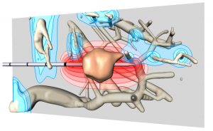
Visualization from Christian's 2011 VisWeek paper showing RF applicator, tumor, the approximated ablation zone in red and thermal cooling of blood vessels in blue.

Visualization from Christian’s 2011 VisWeek paper showing RF applicator, tumor, the approximated ablation zone in red and thermal cooling of blood vessels in blue.

Christian’s work aims at supporting clinical workflows, primarily in radio frequency ablation, supporting both the pre-interventional as well as the interventional stage with highly advanced and carefully adapted visualizations indicating tumors, risk structures, security margins as well as results from approximative simulations that predict the thermal lesion produced by RFA. Illustrative techniques, smart map projections, very efficient GPU realizations as well as careful evaluations with relevant physicians are landmarks of Christian’s work, which may be explored on his website in detail.

(editor: Thanks to Prof. Bernhard Preim for submitting this news. We have always been a fan of Christian and his work, and we are very happy to hear of this success!)

Neuron-level brain-activity map: the Larval Zebrafish edition

Nature recently reported that for the first time, researchers have been able to image an entire vertebrate brain at the level of single cells. For this, they have used a larval Zebrafish that is genetically engineered to have their neurons fluoresce when nerve cells fire. By putting this fish under a special microscope, full brain activity can be recorded every 1.3 seconds. An hour of these recordings adds up to a Terabyte of data. Let’s take a look at some of this pretty data right here:

PhD Candidate Position available in Hybrid Radiotherapy Planning at the UMC Utrecht (The Netherlands)

The University Medical Center (UMC) Utrecht has a PhD candidate position available for four years. You would be working on real-time plan adaptations for a hybrid radiotherapy system. This system, developed between UMC Utrecht, in collaboration with Elektra and Philips, is the world’s first radiotherapy system integrated with a 1.5 T MRI scanner. The system can deliver radiation with mm accuracy while the target is visualized by MRI. The current project concerns the use of real-time MRI guidance for radiotherapy plan adaptations.

More information can be found here. The closing date for this job opening is March 2013. On this page more information about the project and sub-projects is available. From the looks of it, they actually have two positions available.

International Science & Engineering Visualization Challenge 2012 Winners

The annual International Science & Engineering Visualization Challenge organized by the National Science Foundation (NSF) and the journal Science has just announced the winners of 2012. Several winners have contributed medical visualizations:

A malignant brain tumor (red mass, left) of this person’s brain, wreathed by fine tracts of white matter. The red fibers signal danger: If severed by the neurosurgeon’s scalpel, their loss could affect the patient’s vision, perception, and motor function. Blue fibers show functional connections far from the tumor that are unlikely to be affected during surgery. Together, the red and blue fibers provide a road map for neurosurgeons as they plan their operations. Computer science graduate student Maxime Chamberland of the Sherbrooke Connectivity Imaging Lab in Canada produces images like these on a weekly basis, he says. Using an MRI technique that detects the direction in which water molecules move along the white matter fibers, he generates a three-dimensional image of functional connections in the brain.

Cerebral Infiltration. Credit: Maxime Chamberland, David Fortin, and Maxime Descoteaux, Sherbrooke Connectivity Imaging Lab

This image is an artistic rendering of Alya Red, a new computer model of the heart that marries modern medical imaging techniques with high-powered computing. Based on MRI data, each colored strand represents linked cardiac muscle cells that transmit electrical current and trigger a model human heartbeat. Despite centuries of study, scientists are still largely baffled by the heart’s complex electrical choreography, says physicist Fernando Cucchietti, who helped produce the video. The most challenging part was to get the heart fibers in the image to move in a realistic way, Cucchietti says.

Alya Red: A Computational Heart. Credit: Guillermo Marin, Fernando M. Cucchietti, Mariano Vázquez, Carlos Tripiana, Guillaume Houzeaux, Ruth Arís, Pierre Lafortune, and Jazmin Aguado-Sierra, Barcelona Supercomputing Center

Check out these and all the other winners here. If you’d like to compete in the 2013 challenge, the competition opens in February (tomorrow!) and the deadline for your submission is the end of September 2013.

3D Colour X-Ray Imaging

Researchers at the University of Manchester have successfully developed a camera capable of taking 3D colour x-ray images in near-real time. The team is currently working on a the first colour CT scanner. Professor Robert Cernik:

“Current imaging systems such as spiral CAT scanners do not use all the information contained in the X-ray beam. We can use all the wavelengths present to give a colour X-ray image in a number of different imaging geometries. This method is often called hyperspectral imaging because it gives extra information about the material structure at each voxel (3D equivalent of a pixel) of the 3D image. This extra information can be used to fingerprint the material present at each point in a 3D image.”

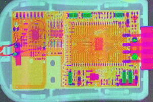
In a recent experiment the team used the technology to X-ray a USB dongle that controls webcams.

The technology is currently being developed in a laboratory setting, but it will be interesting to see what impact this new modality will have on medical imaging. More information about these new developments can be found here.

medvis.org 2012 summary

First of all, happy new year from all of us at medvis.org! May 2013 bring you many job opportunities, research successes and/or good medical visualizations. I’d like to start the new year by looking back at last year briefly. I’ve taken a look at some of our blog statistics and will provide a short summary for those interested below:

2013 IEEE Scientific Visualization Contest: Developmental Neuroscience Challenge

I suppose the theme of the 2013 IEEE Scientific Visualization Contest (a VisWeek 2013 event) is strictly speaking more biovis than medvis, but I thought I’d still mention it here, since the fields are so closely related. In any case, the theme for this year’s scivis contest is developmental neuroscience! There is a dataset available (the Allen Developing Mouse Brain Atlas) tracking the level of gene expression for 2000 genes in 6 stages, organized into 11 categories, in a 3D mouse brain. So that’s a grand total of 12000 expression energy volumes at your disposal.

The challenge is to visualize gradients, structural patterns, structure consistency and complementary patterns for the complete dataset. If you’re up for participating in this contest, you can find more information here. The deadline for the contest is 31 July 2013.